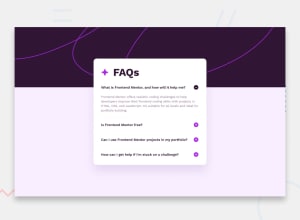
Design comparison
SolutionDesign
Solution retrospective
What are you most proud of, and what would you do differently next time?
I used a data.json to store questions and answers. This makes the code more maintainable.
What challenges did you encounter, and how did you overcome them?I don't particularly appreciate it when there is a clear button, but the question is also clickable. So, I just refused to do it.
Community feedback
- P@danmlarsenPosted 8 months ago
Hello there. Congratulations on finishing another challenge! Your solution mostly responds quite well and looks nice 👏
I've just made a few observations that might interest you:
- The site seems to not be functional on firefox. I just get an console error.
- The background image breaks between mobile and desktop. A quick fix would be to add background-size: contain to your container class
0
Please log in to post a comment
Log in with GitHubJoin our Discord community
Join thousands of Frontend Mentor community members taking the challenges, sharing resources, helping each other, and chatting about all things front-end!
Join our Discord
