

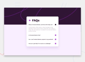
Design comparison
SolutionDesign

Solution retrospective
Difficulty encountered I find it difficult to maintain the height of the background image when the web window shrinks The solution I found was to give it a height of 46%, but I think it is not the best solution
I would appreciate if you could help me with the height of the image My solution
I would also appreciate if you could clarify the following for me To make a website responsive you have to use media queries, is this a good use? or is there another better option? (Is it frowned upon to use media queries?)
styles.css


LINE 19:

     body {
         background-size: auto 46%;
}


LINE 95:
@media(max-width:375px) {
     body {
         background-image: url('./images/background-pattern-mobile.svg');
         background-size: auto 46%;
     }
}
Community feedback
Please log in to post a comment
Log in with GitHub
Join our Discord community
Join thousands of Frontend Mentor community members taking the challenges, sharing resources, helping each other, and chatting about all things front-end!
Join our Discord