Design comparison
SolutionDesign
Solution retrospective
What are you most proud of, and what would you do differently next time?
For next time:
- Set up the dev-enviroment before starting html and css.
Challenges:
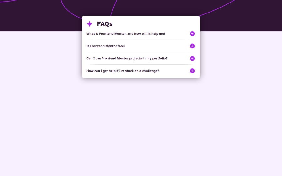
The background image was the hardest part of this as I wanted to make it a good solution without it looking to weird. My solution doesn't show the whole image, but for this project I feel it is working ok. When using the whole image I got stuck with the image jumping between the desktop and mobile image.
Community feedback
Please log in to post a comment
Log in with GitHubJoin our Discord community
Join thousands of Frontend Mentor community members taking the challenges, sharing resources, helping each other, and chatting about all things front-end!
Join our Discord
