Design comparison
Solution retrospective
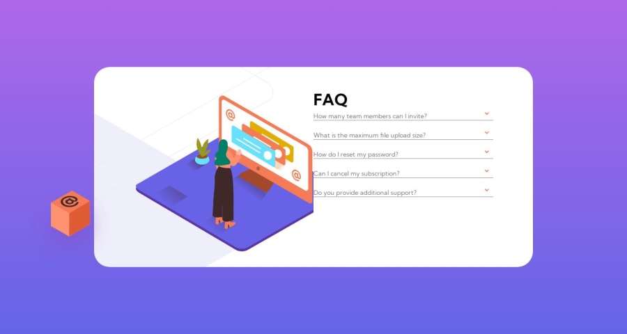
I had a lot of issues with this project, I struggled a lot placing the pictures around and let's not talk about the accordion's moving elements around.
All feedback is welcome!
Community feedback
- @pbryan9Posted 11 months ago
Good job SyuusukeFuji!
I feel ya, images are painful. Sometimes it can help to stick the image into a wrapper (div or similar) and give the img a width of 100% -- that way you can control the size a little more easily by styling the wrapper.
The box image in particular lends itself to a pattern that I reach for over and over again since it wants to sort of straddle the edge of its container. One reliable way to do that is to set the image's parent element to
position: relative;
. Then, make the imageposition: absolute; left: 0;
. That'll make it bump right up against the left edge of the container; to get it to split the line, you can add atransform: translateX(-50%);
to the image and it'll wind up right where you're wanting it (this pattern works just the same for right, bottom, whichever - just get the translateX / Y and the +/-50% set correctly).On the other illustration, I think there's an issue with the background-position property...it seems to behave a little bit better when I take that away completely, so toning down the values might get it to sit closer to where you're wanting it. It most likely needs to be positioned by its left edge.
Keep up the good work!
Marked as helpful0
Please log in to post a comment
Log in with GitHubJoin our Discord community
Join thousands of Frontend Mentor community members taking the challenges, sharing resources, helping each other, and chatting about all things front-end!
Join our Discord