Design comparison
SolutionDesign
Solution retrospective
What are you most proud of, and what would you do differently next time?
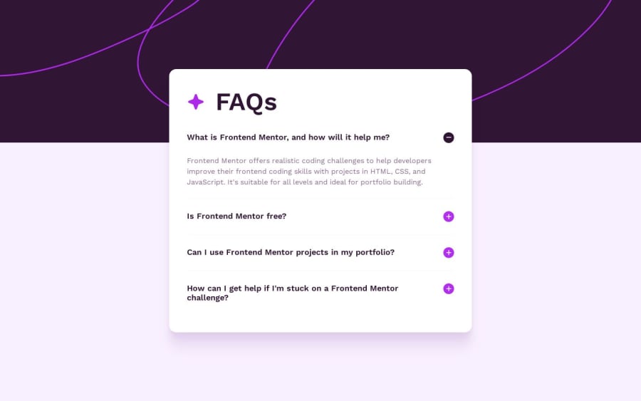
I'm happy I was able to achieve a nice microinteraction animation on the accordion icons. I'd like to take this further with animated SVG paths that morph from one icon to the next, rather than a simple switch between each icon.
What challenges did you encounter, and how did you overcome them?I had a couple of issues with using Lottie for the animated header in using vh and vw but was able to troubleshoot a few times to get it working. I applied a larger vw to ensure it wouldn't appear smaller than the container.
What specific areas of your project would you like help with?I'd like to get some feedback on how to keep the hover state working when the accordion button component is focused.
Community feedback
Please log in to post a comment
Log in with GitHubJoin our Discord community
Join thousands of Frontend Mentor community members taking the challenges, sharing resources, helping each other, and chatting about all things front-end!
Join our Discord
