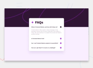
Design comparison
Solution retrospective
I'm learning js and I was having a hard time doing exercises so I feel very proud of doing this exercise
Community feedback
- @MikDra1Posted 3 months ago
What's Right:
- Clean and organized HTML structure.
- Effective use of Flexbox in CSS for layout.
- Clear sectioning for easy readability.
What could be improved:
- JavaScript could be optimized with event delegation.
- Direct DOM manipulation is functional but inefficient.
- You miss accessibility features like aria-expanded attributes for better screen reader support.
Hope you found this comment helpful 💗
Good job and keep going 😁😊😉
Marked as helpful0 - @grace-snowPosted about 1 month ago
I'm afraid this needs a lot of changes. But I'm very reluctant to give them when the last solution was removed straight afterwards.
0@rocioizqPosted about 1 month agoI'm sorry I deleted it because I feel ashamed of how bad it was but I took a screenshot and will correct it now @grace-snow
0@grace-snowPosted about 1 month ago@rocioizq please don't do that. It will put off anyone giving feedback on your work ever.
It is good to have an audit trail of feedback. We all learn and improve incrementally.
It also means mentors can't see who they've said what to before or refer people to other feedback when they face similar problems.
I think you've jumped ahead without getting the important foundational feedback early on. Sadly that means you'll probably need to go back through each project and refactor them.
0
Please log in to post a comment
Log in with GitHubJoin our Discord community
Join thousands of Frontend Mentor community members taking the challenges, sharing resources, helping each other, and chatting about all things front-end!
Join our Discord
