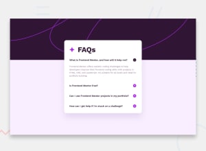
Design comparison
Solution retrospective
I learned a lot in this challenge (thanks @grace-snow)
I've never used the element before and had a lot of trouble with it in the beginning because I didn't know the inspector didn't show the updated source 😭
I originally wrote my HTML/JS for the opening and closing buttons myself, though after I posted in the Discord to ask a question Grace recommend me rewriting it follow her article (https://fedmentor.dev/posts/disclosure-ui/), which I learned a lot from and was much cleaner than my original solution
What specific areas of your project would you like help with?For some reason the background image is 1 pixel short (all screen sizes) on the left and right... I'm not sure why, would anyone have any ideas?
Thanks!
Edit: In the morning I'll go through and fix all the errors/warnings FM mentioned in the accessibility report
Community feedback
Please log in to post a comment
Log in with GitHubJoin our Discord community
Join thousands of Frontend Mentor community members taking the challenges, sharing resources, helping each other, and chatting about all things front-end!
Join our Discord
