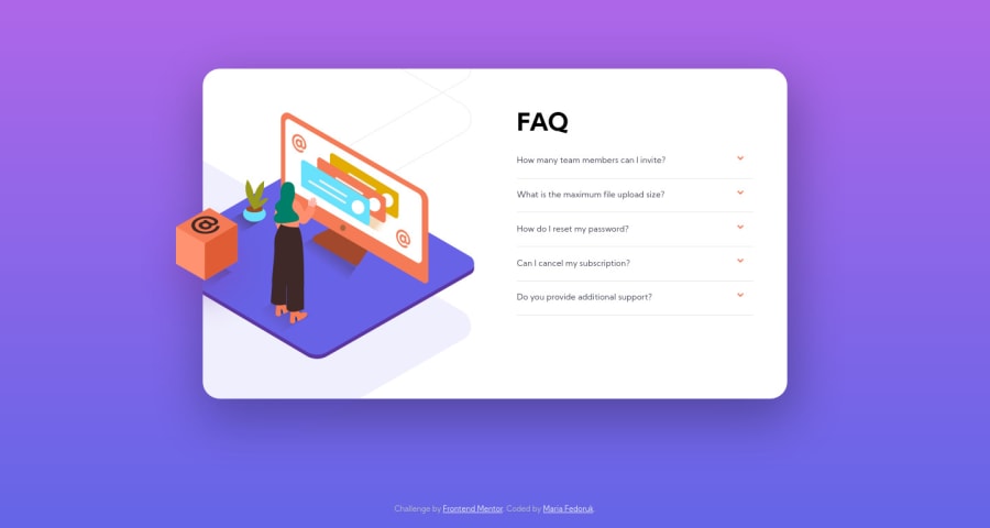
Design comparison
Solution retrospective
Hey there 👋 I built the FAQ accordion mobile-first – then adapting it to a desktop view.
This project was huge for me in terms of learning how to keep the card & container "fixed" and responsive with elements intact, as well as using flex and grid displays for different views. DOM has always looked "easy-to-do" to me but figuring out DOM manipulation with different elements was another learning moment 🙌
So for this, I'd appreciate your advice on CSS/JS refactoring and generally any other feedback. Thank you!
Community feedback
- @janegcaPosted almost 4 years ago
Hi Maria, overall the design looks good on my two screens. A few suggestions:
-
In your HTML, you are not using the 'body' tag, technically, all the elements (other than 'head') should be enclosed within it.
-
Not sure why you have placed your 'script' tag inside the footer. Normally it would go just before the 'body' close tag or up in the 'head' area with the 'defer' property. This is a nice piece of code, wish I had thought to do the same when I did this challenge.
Hope that's of some help. Nice work.
2@itsfedorukPosted almost 4 years agohey Jane! thank you so much for reviewing my code and providing feedback.
-
that's a great catch! I've been working on the habit of including main/footer and other elements for accessibility – and I guess I missed the body tag chasing other tags 😅 so great catch, thank you.
-
I always put the script tag at the end of the document, e.g. before
</body>, to make sure it's functional and loads structure and style first and functionality second. having missed my body tags (as you pointed out), I enclosed it in the last element, e.g. footer.
thanks once again and happy holidays 🎄
0 -
Please log in to post a comment
Log in with GitHubJoin our Discord community
Join thousands of Frontend Mentor community members taking the challenges, sharing resources, helping each other, and chatting about all things front-end!
Join our Discord
