

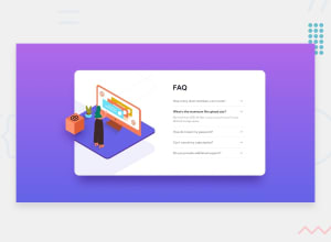
Design comparison
SolutionDesign

Solution retrospective
How to leave the image equal to the example?
Community feedback
- @nmnjnklcPosted about 2 years ago
To get that mobile design, try it like this:
<div class="illustration-container">
        <img class="mobile" src="./images/illustration-woman-online-mobile.svg">
        <img class="desktop" src="./images/illustration-box-desktop.svg">
</div>
and the css would be:
.illustration-container {
  width: 50%;
  position: relative;
  min-height: 32.88rem;
  background-image:
       url(./images/illustration-woman-online-desktop.svg),
       url(./images/bg-pattern-desktop.svg);
  background-position:
       left -5.2rem top 5.8rem,
       left -36rem top -16.8rem;
  background-repeat:
       no-repeat,
       no-repeat;
}
.illustration-container img {
  position: absolute;
  top: 14.3rem;
  left: -6rem;
}
@media only screen and (max-width: 375px) {
    .illustration-container img.desktop {
          display: none;
     }
    .illustration-container img.mobile {
          display: block;
          position: absolute;
          top: -6.6rem;
          left: 0;
    }
    .illustration-container {
         position:relative;
         background-image: url(./images/bg-pattern-mobile.svg);
         background-position: left 0rem top 0vh;
         background-repeat: no-repeat;
         background-size: contain;
         width: 80%;
         min-height: 8rem;
    }
}
Hope this helps. Happy coding!
Marked as helpful0@JoatancarlosPosted about 2 years ago@nmnjnklc thaaaaank you!!! It worked perfectly.
1@nmnjnklcPosted about 2 years ago@Joatancarlos I'm glad I could help. Keep up the good work!
0 - @nmnjnklcPosted about 2 years ago
Hello, @Joatancarlos
To get that illustration to be close as much as possible to the design, you can do something like this: HTML:
<div class="illustration-container">
        <img src="./images/illustration-box-desktop.svg">
</div>
CSS:
.illustration-container {
  width: 50%;
  position: relative;
  min-height: 32.88rem;
  background-image:
       url(./images/illustration-woman-online-desktop.svg),
       url(./images/bg-pattern-desktop.svg);
  background-position:
       left -5.2rem top 5.8rem,
       left -36rem top -16.8rem;
  background-repeat:
       no-repeat,
       no-repeat;
}
.illustration-container img {
  position: absolute;
  top: 14.3rem;
  left: -6rem;
}
Those top/left/right positions worked in my case. Feel free to experiment with sizing and position of images.
Everything else looks awesome. Happy coding!
0

Please log in to post a comment
Log in with GitHub
Join our Discord community
Join thousands of Frontend Mentor community members taking the challenges, sharing resources, helping each other, and chatting about all things front-end!
Join our Discord