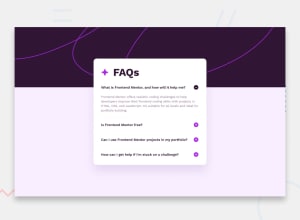
Design comparison
SolutionDesign
Solution retrospective
I hope the code is well organised and understandable
Community feedback
- @danielmrz-devPosted 11 months ago
Hello @Effy1996!
You did a very good job there!
I have just a very simple suggestion for improvement:
- Since the plus/minus icon is also a clickable element, it's nice to add
cursor: pointerto it as well, not just on the question.
I hope it helps!
Other than that, you did a great job!
0 - Since the plus/minus icon is also a clickable element, it's nice to add
Please log in to post a comment
Log in with GitHubJoin our Discord community
Join thousands of Frontend Mentor community members taking the challenges, sharing resources, helping each other, and chatting about all things front-end!
Join our Discord
