Design comparison
SolutionDesign
Solution retrospective
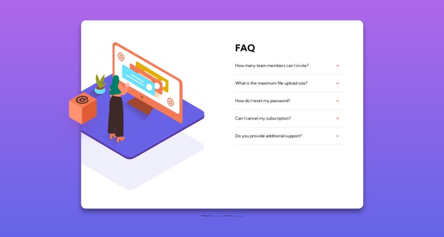
I found putting the desktop image of the woman so that it did not overflow the card quite difficult.
If anyone can let me know how to improve this overall, I would appreciate it :)
Community feedback
Please log in to post a comment
Log in with GitHubJoin our Discord community
Join thousands of Frontend Mentor community members taking the challenges, sharing resources, helping each other, and chatting about all things front-end!
Join our Discord
