Design comparison
SolutionDesign
Solution retrospective
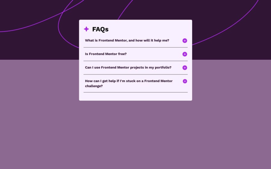
Hey guys
Please review my code. first time building with tailwind CSS framework
Community feedback
- @piushbhandariPosted 11 months ago
did you not have access to the figma file? if not i'll just give some general advice
some general critiques:
- your accordion is not accessible for screen readers. i would suggest adding attributes such as aria-hidden for the accordion content and aria-expander to the button.
- i would avoid giving inline styles. if you're adding these through javascript, it's better to add/remove classes instead
- this is probably opinionated but don't use </hr> and use border-bottom instead. then :last-child to remove the border from the last element per the graphics.
- i wouldn't want to position the accordion via position:absolute as the card shifts when you open an accordion. i would instead, for example, use margin-top: -100px to and position:relative; z-index: 3; to have the accordion overlap with the background pattern. an additional negative side effect to using position absolute here is that it gets ruined for mobile users.
i hope this helps
Marked as helpful0@nonozaPosted 11 months ago@piushbhandari yes I don't have access to figma and thanks for the feedback. Noted.
0
Please log in to post a comment
Log in with GitHubJoin our Discord community
Join thousands of Frontend Mentor community members taking the challenges, sharing resources, helping each other, and chatting about all things front-end!
Join our Discord
