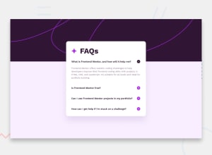
Design comparison
SolutionDesign
Please log in to post a comment
Log in with GitHubCommunity feedback
- @mofada
First of all, congratulations on completing the challenge, you are awesome.
Here are some areas I think can be optimized:
1.Details and Summary
I think maybe you use details and summary is better.
Here's an example:
- list-none: hidden default marker
- after: pseudo element, it's can add icon, such as plus and minus
<details class="group" open>
	<summary
			class="list-none after:w-[30px] after:h-[30px] after:bg-[url('assets/images/icon-plus.svg')] group-open:after:bg-[url('assets/images/icon-minus.svg')]">
		What is Frontend Mentor, and how will it help me?
	</summary>

	<p class="... text style here">
		Frontend Mentor offers realistic coding challenges to help developers improve their
		frontend coding skills with projects in HTML, CSS, and JavaScript. It's suitable for
		all levels and ideal for portfolio building.
	</p>

</details>
Here some article will help you:
- 20 Simple Ways to Style the HTML details Element - This helped me for learn
detailstag. - details.
- summary.
- Details and summary.
2. Responsive Images
And then, the responsive picture can refer to this Responsive_images
<!--background-->
<picture class="absolute top-0 w-full">
	<source media="(min-width: 768px)"
	        srcset="assets/images/background-pattern-desktop.svg">
	<source media="(max-width: 768px)"
	        srcset="assets/images/background-pattern-mobile.svg">
	<img src="assets/images/background-pattern-mobile.svg" alt="Decorative background pattern"
	     class="w-full object-cover">
</picture>
If you want to known more details, you can check my solutions faq-accordion-with-tailwind-css
Join our Discord community
Join thousands of Frontend Mentor community members taking the challenges, sharing resources, helping each other, and chatting about all things front-end!
Join our Discord
