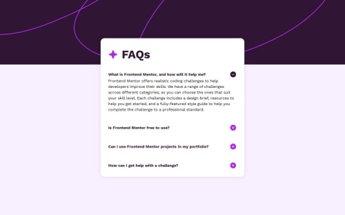
Submitted about 1 year agoA solution to the FAQ accordion challenge
FAQ-Accordion using React
react, vite
@garbiru

Solution retrospective
What are you most proud of, and what would you do differently next time?
The dummy texts are a bit different, font sizes too, I just did this on a eye level basis, just tried to replicate as close as the design.
What challenges did you encounter, and how did you overcome them?The background image/color, I didn't use the provided image for mobile, just the one for desktop, as I saw in small screens it didn't look bad I left it as is.
Code
Loading...
Please log in to post a comment
Log in with GitHubCommunity feedback
No feedback yet. Be the first to give feedback on Gabriel Garcia's solution.
Join our Discord community
Join thousands of Frontend Mentor community members taking the challenges, sharing resources, helping each other, and chatting about all things front-end!
Join our Discord