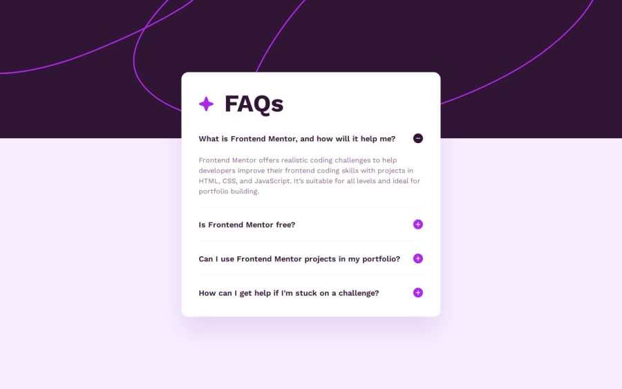
Design comparison
Solution retrospective
I wanted to use my React skills here after not creating a React project in a while and it went smoothly. I've learned a lot about structuring the actual project and will be using less code from the get go next time.
What challenges did you encounter, and how did you overcome them?It was fiddly to get the heights on the questions and answers to look right. I'm averse to too much mark up but I think it might have saved time here but just submitting to it and using divs to solve layout problems - especially with max-heights and padding causing me issues with looking right.
What specific areas of your project would you like help with?I couldn't quite get the header image looking right. I'll be interested in how others laid out the main image.
Community feedback
Please log in to post a comment
Log in with GitHubJoin our Discord community
Join thousands of Frontend Mentor community members taking the challenges, sharing resources, helping each other, and chatting about all things front-end!
Join our Discord
