FAQ Accordion using Next.js and Tailwind
Design comparison
Solution retrospective
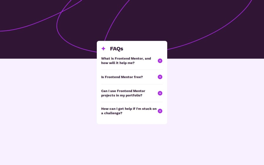
I'm stuck on these two things:
- How do I stretch the background image to full width but not full height like in the design? This is the jsx for the page that contains the FAQAccordion component (full code here):
<main
  className="flex min-h-screen w-full items-center justify-center overflow-hidden bg-faqLightPink"
  style={{
      backgroundImage: `url(${backgroundImage.src})`,
      backgroundRepeat: "no-repeat",
      backgroundSize: "auto",
  }}
>
  <FAQAccordion />
</main>
- Using Tailwind how do I make nice transitions when the answers open and close? I tried adding
transition-all duration-300to the<p>elements that contain the answers but it doesn't work:
<p className={`mt-6 text-faqGrayishPurple transition-all duration-300 ${activeIndex === idx ? "block" : "hidden"}`}>
  {answer}
</p>
Edit: I managed to fix both problems. The transitions one was tricky: I ended up animating the max-height property from 0 to element.scrollHeight, instead of trying to transition from "display: none" to "display: block".
Community feedback
- @strikes7Posted about 1 year ago
hi, for the the background problem, you can solve it with background-size: 100% auto, the first value is for the width and the second for the height, the problem lies in that you are using the mobile background image in the desktop version of the page. also you can use other values for the height like rem, %, px to match more closely the design.
Marked as helpful0
Please log in to post a comment
Log in with GitHubJoin our Discord community
Join thousands of Frontend Mentor community members taking the challenges, sharing resources, helping each other, and chatting about all things front-end!
Join our Discord
