Design comparison
SolutionDesign
Community feedback
- @yozidstPosted 11 months ago
Hi 👋
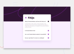
Congratulations! on the challenge. A quick tip I would recommend is to give your container a desired margin-top value.
eg.
.container {
    position: relative;
    display: flex;
    align-items: center;
    flex-direction: column;
    padding: 34px;   // depending on preference; bottom padding* mainly
    margin-top: 134px  // depending on preference; this was my setup
}
The padding or margin-top can be excluded for an inner div, depending on if you have another content div inside for all the info. This way your accordion is prevented from expanding higher and eventually cutting off your information; especially on the mobile layout.
Keep up the grind! 👊
Marked as helpful1@mkandan1Posted 11 months ago@yozidst Thank you for your detailed feedback on my solution.
0
Please log in to post a comment
Log in with GitHubJoin our Discord community
Join thousands of Frontend Mentor community members taking the challenges, sharing resources, helping each other, and chatting about all things front-end!
Join our Discord
