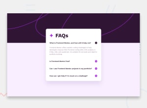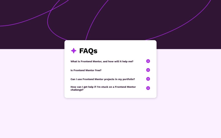
Design comparison
Solution retrospective
I didn’t have any major issues when completing this project but any suggestions to improve my mobile view would be appreciated. Thanks.
Community feedback
- @MelvinAguilarPosted 10 months ago
Hello there 👋. Good job on completing the challenge !
I have some suggestions about your code that might interest you.
-
The <h2> element is typically used for headings and not interactive elements. For interactive elements, it's better to use semantic HTML elements that convey their functionality to both users and assistive technologies.
Consider changing the
<h2>
element to a<button
> element and associating an appropriate click event. This not only provides a more meaningful structure but also allows users to interact with the element more effectively, including using the keyboard.
I hope you find it useful! 😄
Happy coding!
Marked as helpful1 -
Please log in to post a comment
Log in with GitHubJoin our Discord community
Join thousands of Frontend Mentor community members taking the challenges, sharing resources, helping each other, and chatting about all things front-end!
Join our Discord