

Design comparison

Solution retrospective
Hey Guys!
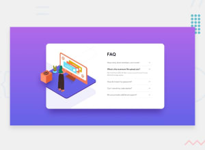
Just finished this accordion and learned a bit of Javascript. But you can also make an accordion without Javascript.
I need some feedback on my other solutions so I can learn from it.
Learning is ENDLESS!
Community feedback
- @arlagonixPosted over 2 years ago
It looks awesome! I love it!
-
The layout is responsive and looks nice on different resolutions. Although on the smallest resolution text inside of the 1-st, 3-rd sections seem to not have enough space
-
Awesome animations! Looks very smooth. It looks fantastic that the background also resizes with the frame when you open the details
-
Nice that you made the bold highlight only when the details are opened. It looks better than in the initial design
-
It seems to me that the font size might be a bit bigger. 11px and 14px are a bit small. There is enough space for bigger text: 16px + 24px for example
-
I think it would look better if your stylized a bit more the part "Challenge by ... Coded by ...". It looks a bit out of place. I'd make the text bigger, changed the font family, the font color
-
Also changing gradient background might fit here perfectly (as soon as it's initially already some sort of gradient). Here's a guide from Kevin Powell channel: https://www.youtube.com/watch?v=f3mwKLXpOLk&ab_channel=KevinPowell. It's quite easy: make background size big and move it from side to side with an infinite animation
-
Another way to enhance the solution is to probably add some icons to the left of the questions. There are not so many of them, but that might make the text easier to look through
Marked as helpful1@FahatmahPosted over 2 years ago@GrbnvAlex Thank you very much for the feedback! It would be a very helpful to me.
1 -

Please log in to post a comment
Log in with GitHubJoin our Discord community
Join thousands of Frontend Mentor community members taking the challenges, sharing resources, helping each other, and chatting about all things front-end!
Join our Discord