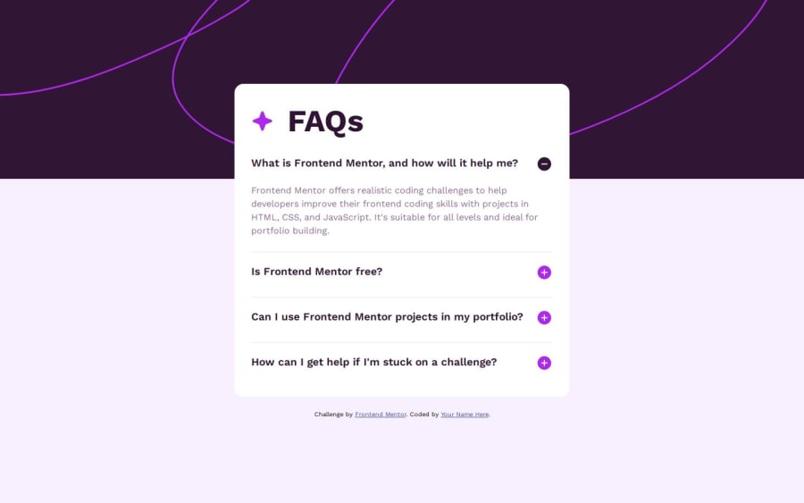
Design comparison
Solution retrospective
⚠️NEED YOUR HELP⚠️
1, How can I keep the questions where they are now?
They move up when they are clicked. I would like to keep the questions where they are even thought when they are clicked.
2, Struggling with media query for mobile
When I checked the page on my phone, it didn't appear well. How can I make the page fit in to the mobile size?
Any feedbacks will be really appreciated:)
Community feedback
- @daHattaPosted about 1 year ago
Hi Sae,
it looks pretty good so far. According to your questions I might have some tips for you. I solved the quest by setting the whole accordion at the top of the page with the distance mentioned in the design, so the whole thing stays fixed and moves only downwards.
Another thing I did, I wrote a function which closes all answers first, followed by the opening of the answer of the clicked question. So every questions stays where it is.
I set only margin-inline: auto and a width for my solution to center my accordion properly. Might be a solution for you too?
I also recommend to use main and section to get the right landmarks. I get often warnings about landmarks by myself. ;)
Hope my answer was helpful!
Keep up coding. You are awesome! :)
0
Please log in to post a comment
Log in with GitHubJoin our Discord community
Join thousands of Frontend Mentor community members taking the challenges, sharing resources, helping each other, and chatting about all things front-end!
Join our Discord
