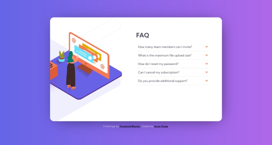
Design comparison
Solution retrospective
A big struggle (and one that I didn't come to a solution on) was how to position the images such that:
a) they were positioned with respect to the card b) they maintained position relative to each other c) they maintained position in a responsive way d) one of them had overflow and the others did not
Otherwise, fun project and it made me tackle making an accordion without using a framework or JS.
Community feedback
- @kenreibmanPosted about 3 years ago
Great job! You're so close to the final result, and I commend your hard work and effort :)
On the desktop layout for the left illustration section, this project requires multiple layers that act as a
position: relative, in addition to uses ofz-index, and the illustration ends up being anposition: absolutethat doesn't get hidden by the main card container.It might be hard to see, but take a look at my code or any Youtube video that covers this solution.
Your viewport width at
375pxhas the card overflowing. Although I haven't checked your actual code, this is due to you setting fixed heights such as using theheightandwidthproperty. I would recommend you usingmax-widthfor containers andmin-heightfor your parent body elements to establish a height.0
Please log in to post a comment
Log in with GitHubJoin our Discord community
Join thousands of Frontend Mentor community members taking the challenges, sharing resources, helping each other, and chatting about all things front-end!
Join our Discord
