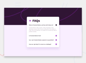
Design comparison
SolutionDesign
Solution retrospective
What are you most proud of, and what would you do differently next time?
I wanted to challenge myself to do this without JS and had fun learning about checkmarks and more pseudo-selectors. If I were building this for a scalable site I don't know as that is viable, but most FAQ pages don't seem to change much and I felt it was good to learn this approach.
Community feedback
Please log in to post a comment
Log in with GitHubJoin our Discord community
Join thousands of Frontend Mentor community members taking the challenges, sharing resources, helping each other, and chatting about all things front-end!
Join our Discord
