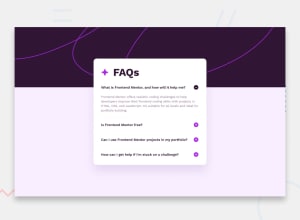
FAQ Accordion using Grid only responsive Design
Design comparison
Solution retrospective
Well, this is my attempt at the FAQ Accordion design.
Got a little stuck on the best way to code it.also need to address the jumpy movement on opening the first FAQ. Other than that I think I covered it...
You be the judge!
Community feedback
- @MelvinAguilarPosted about 1 year ago
Hello there 👋. Good job on completing the challenge !
I have some suggestions about your code that might interest you.
- Never set
overflow: hiddenon the body element unless you're displaying a modal. It should not have overflow: hidden because this disables scrolling, which is bad for mobile users. Even I had zoom, and I wasn't able to see the bottom part of your solution 😢.
position: relativeis also unnecessary on the body element, and it's better to use a CSS reset to remove default browser styles than settingmargin: 0on the body element.
- The
<div class="attribution">should be a footer element.
- While div is excellent for positioning and styling, it's not an interactive element. It should not have a cursor pointer because it's not intended for that purpose. You should replace it with an interactive tag, like a button.
I hope you find it useful! 😄
Happy coding!
3@techyjcPosted about 1 year ago@MelvinAguilar removed the overflow hidden. the position relative is there for the attribution which has position absolute (bottom of the page).
I just decided not to use a CSS reset as I can use the cascade and remove margins/padding at different levels or setup a utility class.
I can swap the div for a tag or button then just modify the javascript to prevent default. But it was more about just practising. I'm doing this for fun!
Thanks for the feedback, thought I'd share my own thoughts.
John Carruthers
0@techyjcPosted about 1 year ago@MelvinAguilar I have made most of the changes including removal of overflow.
1 - Never set
- P@danielmrz-devPosted about 1 year ago
Hello @techyjc!
Your project looks pretty good!
I have just one suggestion:
- Since the plus icon is a clickable element, it's nice to add
cursor: pointer;to it.
I hope it helps!
Other than that, great job!
1@techyjcPosted about 1 year ago@danielmrz-dev Good point. I will amend the CSS. Have a few other bits to fix as well. Thanks for the feedback.
1 - Since the plus icon is a clickable element, it's nice to add
- @techyjcPosted about 1 year ago
Appears to be some errors with aria attributes. I will correct them.
0
Please log in to post a comment
Log in with GitHubJoin our Discord community
Join thousands of Frontend Mentor community members taking the challenges, sharing resources, helping each other, and chatting about all things front-end!
Join our Discord
