Design comparison
SolutionDesign
Solution retrospective
What are you most proud of, and what would you do differently next time?
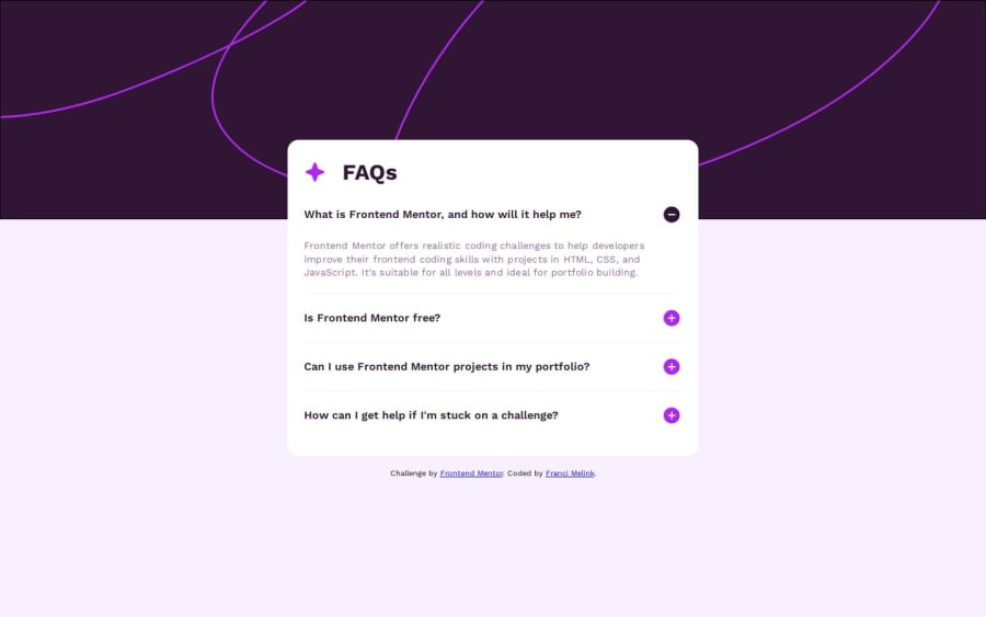
I think the project worked out pretty well for me. Next time I would try to solve something like this with a grid layout
What challenges did you encounter, and how did you overcome them?What took me some time was that I tried every way to add the background image to the body itself. I had problems because I somehow wanted the image to always be about 30% of the viewport. I later bypassed this with a header element and set a fixed height that I got using figma.
What specific areas of your project would you like help with?As I mentioned above, I am interested in how to make the background image height 30% regardless of the screen. It somehow didn't work for me at all, if I take landscape orientation on mobile
Community feedback
Please log in to post a comment
Log in with GitHubJoin our Discord community
Join thousands of Frontend Mentor community members taking the challenges, sharing resources, helping each other, and chatting about all things front-end!
Join our Discord
