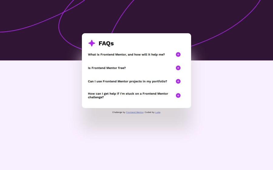
Design comparison
Solution retrospective
I decided to look into how to create an animation for the accordion expanding and shrinking, and picking apart some other accordions in console along with going through a tutorial on css-tricks helped me finally wrap my head around constructors and objects as a concept. I guess seeing them in practical use was the final hurdle.
If I were to restart it, I would probably figure out a css preprocessor but the scale of the project made it feel unnecessary at the time
What challenges did you encounter, and how did you overcome them?When implementing the JS animation, there was an issue where a margin under the summary was making the animation stutter, because it wasn't factored into the calculations and would skip about 20px at the end. Figured it out by comparing height values in the dev console, and fixed the bug by including the margin in the endHeight calculations (it's a hardcoded 16px which is a little messy) As I understand it Jquery has a 1-line method for getting the outerHeight including the margin but vanilla JS does not, so it's probably time to stop procrastinating and look into Jquery
What specific areas of your project would you like help with?I'm familiar with the different options for drop-shadows in photoshop but actually implementing the glow behind the info panel in CSS is a different beast entirely. It would either be too bright on the dark half or too dark on the light half, and I eventually arrived at something that looks ok if you don't pixelpeep. Is there a way to adjust opacity on the dropshadow without altering the element it's linked to?
Community feedback
Please log in to post a comment
Log in with GitHubJoin our Discord community
Join thousands of Frontend Mentor community members taking the challenges, sharing resources, helping each other, and chatting about all things front-end!
Join our Discord
