Design comparison
Solution retrospective
Hello Frontend Mentor Community,
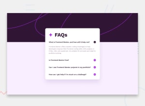
Here is my solution for Faq Accordion.
Any feedback is highly appreciated.
Thank you.
Community feedback
- @danielmrz-devPosted 12 months ago
Hello @nazimulhossain!
Your project looks great!
I have a few suggestions for you to improve it:
-
Since the questions and the icon are clickable elements, it's a good practice to add
cursor: pointer;to both of them. This improves the user experience. -
Also, if you add the background pattern to the
body, it'll look even closer to the original design.
I hope it helps!
Other than those little details, you did an excelent job!
Marked as helpful1 -
- @LejNurPosted 12 months ago
Good job! :) Maybe you should try putting the click also on the h2 element (question) not only on the button (icon +). Good exercise would be to close previously opened answer when you click on the next question (like toggle the responses). Happy coding! :D
Marked as helpful1
Please log in to post a comment
Log in with GitHubJoin our Discord community
Join thousands of Frontend Mentor community members taking the challenges, sharing resources, helping each other, and chatting about all things front-end!
Join our Discord
