Design comparison
Solution retrospective
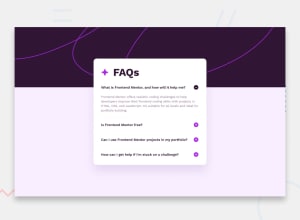
Hey guys! That was my solution to this challenge. 💜
It's the first time I've done a project with Javascript and I'm not sure if I used it in the best way.
I wanted the answer to open without moving up the card every time I open a topic. How could I do this?
Feel free to comment and suggest improvements 🥰
Community feedback
- @santiagodev10Posted 8 months ago
Hi Rachel, i like your approach to this challenge, i think you did a fine work, i also did this challenge and i think i can give you some feedback to your question. You are saying that the card is going up when you press the accordion, and after i review your code i notice that you set the height of the body in 100vh, vh is a relative measure, so you need rather to eliminate the height property and leave it with his default value or you can set the height to an absolute measure, for example 140px, that would make that the background image always maintain the same size no matter the screen size, and then when you press again the accordion doesn’t move up the card. By the way, if you also want to move down your card a little bit to separate it from the background image and the top, you can add a margin top in the section tag who has the class "main_card" i hope that help you 😁 i left a pull request with some little fixes in your github.
Marked as helpful1
Please log in to post a comment
Log in with GitHubJoin our Discord community
Join thousands of Frontend Mentor community members taking the challenges, sharing resources, helping each other, and chatting about all things front-end!
Join our Discord
