

Design comparison

Community feedback
- @grace-snowPosted 3 months ago
Im afraid you need to rewrite this as already mentioned in other feedback. Try and use it with your keyboard for example and you'll see this is inaccessible.
If you want to use JS, follow the aria authoring practices guide accordion pattern or my tutorial on building accessible disclosures https://fedmentor.dev/posts/disclosure-ui/.
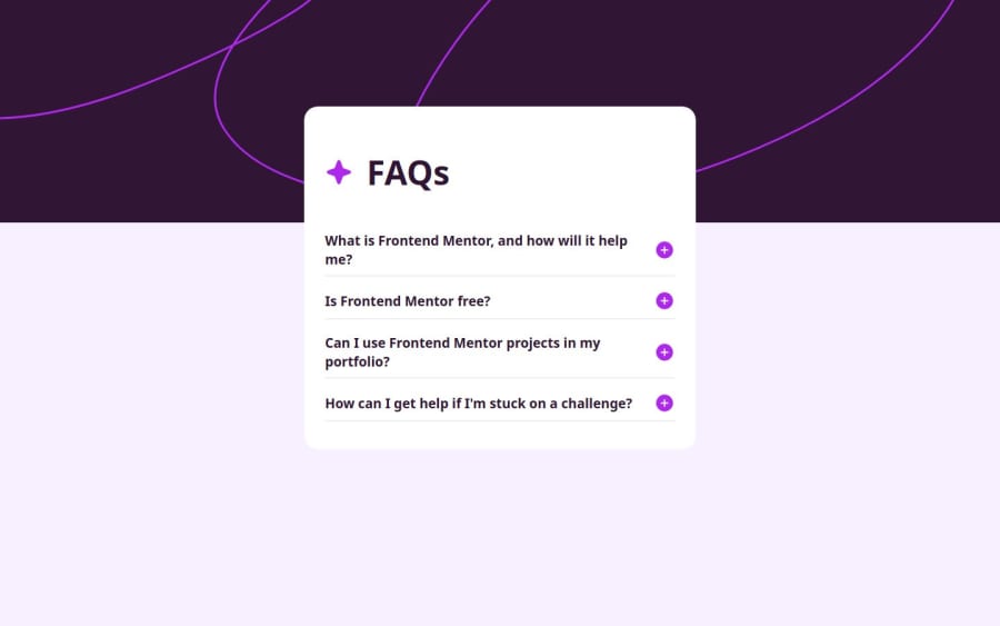
If you want to do a html-css only version, use the details and summary elements.
Marked as helpful1 - P@kaamiikPosted 3 months ago
Hi. Congrats for doing this challenge. a few notes to improve your solution:
- A good way to create an accordion is to use the
<details>and<summary>tags. This approach is more semantic and provides a better solution for screen readers as well. This is a good resource from Adrian Roselli you can read too.
- Placing text directly inside your
divelements is not recommended. Instead, text should be placed within semantic elements or elements that have the appropriateroleattribute. I suggest researching more about how to create an accessible accordion to improve your approach.
- Try to use a proper CSS reset at the start of your CSS style. Andy Bell and Josh Comeau both have a good one. You can simply search on the internet to find them.
- Never limit your width and height in a container or
mainelement or tag that contains text inside. When you limit the width and height of elements containing text, you risk the text being cut off, overflowing, or becoming unreadable, especially on smaller screens or when the text dynamically changes. It's generally better to allow the container to adjust its size based on its content or set a flexible size that can adapt to different screen sizes and text lengths. You only needmax-widthhere inside yourmainbecause it prevents elements from stretching beyond a certain point, keeping them visually appealing across different screen sizes. It ensures your design remains adaptive and doesn't get too wide on larger screens.
- Do not use
vworvhfor padding and margin. It's wrong. useemorrem. Those units only good for some rare purposes and you have to be careful to use them.
1@grace-snowPosted 3 months ago@kaamiik This is great feedback. But em or rem aren't always the best choice for padding/margin, sometimes px is ideal too. Just don't forget that.
2@AzumaCodesPosted 3 months ago@grace-snow @kaamik Thank you both for your feedback! This is invaluable feedback and I shall go back to the drawing board to see how I can implement these.
0 - A good way to create an accordion is to use the


Please log in to post a comment
Log in with GitHubJoin our Discord community
Join thousands of Frontend Mentor community members taking the challenges, sharing resources, helping each other, and chatting about all things front-end!
Join our Discord