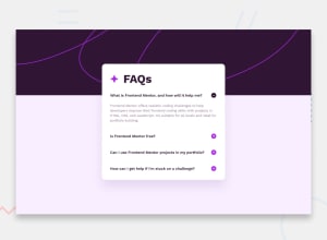
Design comparison
Solution retrospective
I was able to finish in less time than I expected, I'm proud of that.
What challenges did you encounter, and how did you overcome them?I tried placing the container in the middle using the translate property. It didn't work out so well. I had to resort to using the margin-top property.
What specific areas of your project would you like help with?I would like resources that can help me to learn JS for Frontend development. I know the functions and arrays, but I don't know how to implement them in my projects. Any other suggestions on how to improve are highly welcome.
Community feedback
- @Callyx2002Posted about 1 month ago
@pstar8, I think you should use the querySelectorAll method for the icon, response and question so it can take all instances of each of them as an array.
0 - @Callyx2002Posted about 1 month ago
Hi @pstar8, nice work there, especially the styling. I think you should check the JavaScript logic; the plus function seems not to be working
0@pstar8Posted about 1 month agoHi @Callyx2002, thank you very much.
About the JavaScript logic, could you please go through mine to see what's wrong. I can't seem to find the problem yet the only one of the accordion is responding.
It would mean a lot if you rendered some advice on how to fix the code.
0
Please log in to post a comment
Log in with GitHubJoin our Discord community
Join thousands of Frontend Mentor community members taking the challenges, sharing resources, helping each other, and chatting about all things front-end!
Join our Discord
