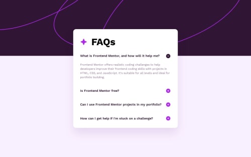
FAQ accordion (Tailwind CSS)
Design comparison
Solution retrospective
Hi there π, Iβm Melvin, and this is my solution for this challenge. π
π Features:
- Achieved 100% in Lighthouse score for performance, accessibility, best practices, and SEO. π
- Progressive Web App (PWA) support. π±π
- Utilized TailwindCSS for responsive styling. π¨
- Codebase is well-maintained and formatted using Prettier. π»
- Resemblance with the original design. π¨
- No media queries were used. π±
- Integrated very small animation. β¨
π» Two Solutions in Two Branches:
- Native HTML Solution: Utilizing
<details>
and<summary>
tags without the need for JavaScript. π - Accessible Disclosure Solution: Implementing Accessible Disclosure with a11y in mind for enhanced accessibility. π
π οΈ Built With:
- TailwindCSS. π¨
- npm - prettier - prettier-plugin-tailwindcss. π»
-
π Further Resources:
If you're interested in creating an Accessible Disclosure, I recommend checking out this informative article by Grace Snow: Tutorial: Let's Build an Accessible Disclosure
Any suggestions on how I can enhance this solution or achieve even better performance are welcome!
Thank you. πβοΈ
Community feedback
- @javascriptor1Posted 11 months ago
Hi Melvin,
Excellent solution as always. Your native solution draws my attention to the fact that CSS selectors like:
:is and :not can work as if condition combined with HTML attributes which makes it possible to get rid of JS code when you have two options to choose from.
Thanks for your excellent contribution to FEM. I enjoy looking at your code always.
Regards, MKF
1@MelvinAguilarPosted 11 months ago@javascriptor1 Thank you so much for your kind words! π I'm glad you found the solution helpful. Your support means a lot! π
3 - @yogiazyPosted 11 months ago
Thanks! π I've learned new features from your solution.
1@MelvinAguilarPosted 11 months agoYou're very welcome! π @yogiazy
Thank you so much for your comment !
1 - @Finney06Posted 11 months ago
Isn't the button meant to close when another button is been click...?
1@MelvinAguilarPosted 11 months agoHi @Finney06
I think it depends on the designer. There are different types, like Multiselectable, which allow you to display multiple contents at once, and the ones you mentioned, which only allow showing one.
The challenge requirements don't mention it specifically, and the one it's mostly based on, in terms of behavior, is the one I've seen the most. Even Frontend Mentor has it in their "Challenge FAQs" section or on any challenge page. At the bottom, there's an accordion with this behavior. π¨β¨
Happy coding
1 - @DalaScriptPosted 6 months ago
Hey, Welll done!!
May I ask you, How do you write Solution retrospective, without this 3 questions and with your own title?
Thanks in Advance.
0@MelvinAguilarPosted 6 months ago@NikaDalalishvili
Hello, the platform received an update a few months ago with those 3 questions to make it easier to help people. Before that, you only had one field where you could write whatever you wanted. This solution was uploaded before that update, which is why it doesn't have the questions.
As a curiosity, you can decorate your texts and make them bold using markdown in the text. For example, use:
**this is my title**
And the result is:
This is my title
1@DalaScriptPosted 6 months ago@MelvinAguilar
Ah, okay, I thought, it was something special. Thank u so much.
0 - @SamehCodePosted 11 months ago
what about the main idea of accordion ? when select a topic the rest of topics must be not visible
https://getbootstrap.com/docs/5.3/components/accordion/
search for accordion to get the main idea
i've added link for you from bootstrap accordion check it out
0@MelvinAguilarPosted 11 months ago@SamehCode
Hi!! Thanks for the comment.
There are various types; mine is multiselectable. It depends on the context and what the user needs. The challenge doesn't specify the type, and I suppose it's better to have all the information.
In the link you provided from Bootstrap, there's even an example of this type, found in the "Always open" section. It mentions, "Omit the data-bs-parent attribute on each .accordion-collapse to make accordion items stay open when another item is opened " . That is exactly the behavior I use in this challenge.
https://getbootstrap.com/docs/5.3/components/accordion/#always-open
Happy coding
2 - @javascriptor1Posted 11 months ago
I also forgot to mention I could not see the thin line in your solution between questions.
I wonder how do you solve this usually? do you use <hr> tag? or border-bottom? Or other approaches?
0@MelvinAguilarPosted 11 months agoHi @javascriptor1. Is there a dividing line? I didn't notice when doing the challenge, it seems I have trouble seeing faint colors haha, but I might have used a
border-bottom
. π€πThanks for pointing out my mistake!
2@javascriptor1Posted 11 months agoNever mind - I always face same problem with very light colors when doing challenges.
Thanks for your feedback. @MelvinAguilar
0@ChomikensPosted 11 months ago@javascriptor1 you can create border bottom this is simple way.
Or another approach use ::after and them owl selector: * + * to add fancy margin to be more consistant.
In short words it will ad margin ro all elements that have previous sibling.
You can read about ot herehttps://alistapart.com/article/axiomatic-css-and-lobotomized-owls/
2@javascriptor1Posted 11 months agoHi @Chomikens,
Thanks - Appreciate your valuable feedback.
1
Please log in to post a comment
Log in with GitHubJoin our Discord community
Join thousands of Frontend Mentor community members taking the challenges, sharing resources, helping each other, and chatting about all things front-end!
Join our Discord