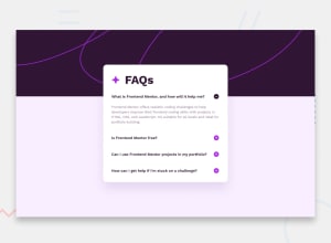
Not Found
Not Found
Not Found
Not Found
Not Found
Not Found
Not Found
Not Found
Not Found
Not Found
Not Found
Not Found
Not Found
Not Found
Not Found
Not Found
Not Found
Not Found
Not Found
Not Found

Submitted

FAQ Accordion Solution using HTML and CSS

P
Jose 90

@josenegrete123

Desktop design screenshot for the FAQ accordion coding challenge

This is a solution for...

  • HTML
  • CSS
  • JS
1newbie
View challenge

Design comparison


SolutionDesign

Solution retrospective


What are you most proud of, and what would you do differently next time?

Most proud of how I used the @media in CSS. Next time I would figure out which code to include inside of the tag instead of reusing code.

What challenges did you encounter, and how did you overcome them?

Main challenge was figuring out how to make the `` tag into a Flexbox. I googled and was able to figure out the answer by using details > summary in CSS to create a Flexbox.

What specific areas of your project would you like help with?

I would like to ask for help on the @media area of my CSS and if anyone could explain how to better utilize it and if rewriting the code is good practice or better to exclude already written code.

Community feedback

@AgilePanda482

Posted

Hi @josenegrete123!

The best way to use @media is interestingly enough to use it in the least possible way.

The idea of modern CSS development is to use the “Mobile-First” approach, since a large part of web traffic comes from mobile devices. So, it is better to start designing on small screens and then the big screens, so we use good practices in programming, save code and have more ease in maintaining it.

So, if it is best to use @media as little as possible, what is the right way?

To what I have been seeing, is to make the web as smooth as possible, achieving this by using more “flexible” units such as rem, vh or % instead of using px. Also using min-height / max-height or min-width / max-width instead of just width or height since these last values are static values, making our page less responsive. As an observation, you will use the min-width / min-height values more but remember that it all depends on what you want to do.

Finally, as a tip, I noticed that in your CSS code with the @media you repeat all the code, thing that the @media serve for the opposite, so that you only modify certain values, example:

main {
    min-height: 95vh;

    display: flex;
    justify-content: center;
    align-items: center;
}

.container {
    padding: 1.70rem;
    max-width: 42vh;

    display: flex;
    flex-direction: column;

    border-radius: 1rem;
    background-color: var(--White-color);
}

@media (min-width: 500px) {
    main {
        min-height: 90vh;
        min-width: 270px;
    }
    .container {
        padding: 2rem;
        max-width: 95vh;
    }
}

I hope all this has helped you!

Best regards, Sebastian.

Marked as helpful

1

Please log in to post a comment

Log in with GitHub
Discord logo

Join our Discord community

Join thousands of Frontend Mentor community members taking the challenges, sharing resources, helping each other, and chatting about all things front-end!

Join our Discord