Design comparison
Solution retrospective
I was given feedback on my last project and tried to incorporate that advice into this one. I made an effort to make the page more responsive by using rem and line height instead of pixels. I also learned to use CSS variables and more semantic HTML. Next time I'd like to take more time to plan before I start coding, as I usually just hop in and try to figure it out.
What challenges did you encounter, and how did you overcome them?The big challenge I had again was layout, but I was able to get positioning how I liked it with flexbox. The Javascript for the buttons and tabs took a while to figure out, so I had to study up on that.
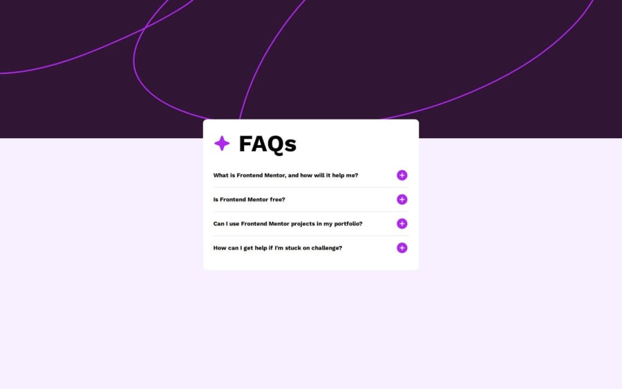
What specific areas of your project would you like help with?Getting the background image to be exactly where its supposed to be.
Community feedback
Please log in to post a comment
Log in with GitHubJoin our Discord community
Join thousands of Frontend Mentor community members taking the challenges, sharing resources, helping each other, and chatting about all things front-end!
Join our Discord
