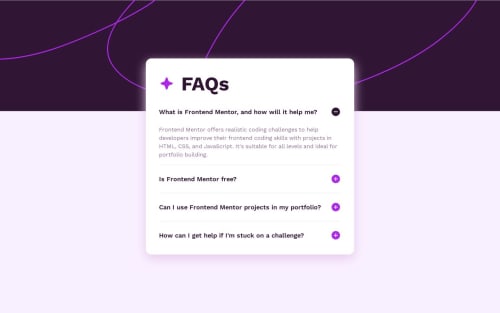
FAQ accordion solution

Solution retrospective
Hello everyone 👋, I'm Mohammed and this is my solution to this nice challenge.
This challenge was very easy to solve. FAQ is a very common component of lots of web pages and this challenge is very good to make you ready and gain the required skills.
Box shadow is still a problem for me. I can't figure out how to match the design😢
I will briefly talk about my current process of solving FEM challenges and I hope it will help and inspire other beginners (like me 😊). To make this process actionable so others can follow, I will list the steps I take to solve the challenge-
1- I download the challenge resource file and extract it in a special folder so I can use it in the future if needed without having to re-download it again.
2- After the files were extracted, I read about the requirements to solve the challenge.
3- After reading the requirements, I open the design folder to see the final product both for mobile and desktop screens. I also take note of the number of active state elements so I don't forget to do it while solving the main challenge.
4- After I see both photos for screen designs, I take some notes on how best to do the HTML markup and how to structure the elements in the page. This is a very very important issue and help in later steps. I pick up the best semantic tags which serve the purpose of the content.
5- I then create CSS styling and Javascript files, link them to the HTML file, initialize a new git repo, and make an initial commit on the master branch.
6- Then I do the actual markup of all texts in the challenge file for mobile screens. for example, if a text is best displayed as an H1 tag, I wrap the text in h1 tag using a shortcut in VScode, etc.. I also add images and icons at this stage. then I create a new git branch for mobile design before I start styling.
Note: I always do mobile-first solution and don't combine mobile and desktop styling at the same stage.
7- After I finish the markup stage, I go to the styling stage targeting mobile screens. I use a live server on VScode, go live and open the page in my Chrome, then use the Pixel perfect extension to load the design file for the mobile screen as an overlay on top of my actual page. I make sure the overlay image is exactly 100% on top of my HTML page. I make sure I choose the right screen resolution which is 375px.
8- At this stage, I use the Responsively app to see how the page will look like on different screen sizes. I usually have the following screen sizes opened at the same time:
- iPhone SE 375px Fem design size for mobile
- iPhone Pro Max 428px
- iPad mini 768px
- iPad Air 820px
- iPad Pro 1024px
- My screen size 1366px
- MacBook Pro 1440px Fem design size for desktop
9- After I finish the mobile screen design, I commit all changes, check to master branch, then merge the mobile-design branch with the master branch.
10- I then create a new branch for desktop design, load the design image as an overlay on Chrome using the extension, and start coding on a custom screen size of 1440px I created for this purpose.
11- I repeat step 9 with the desktop branch. Then I create a new branch to style active state elements and I repeat step 9 after I finish all requirements.
Note: I will add a new git branch in the future for accessibility, SEO, and performance so I improve this area also.
12- I move to the Javascript part of the challenge after I create a new git branch for it.
13- After I solve the Javascript part, I commit and merge into the master branch and my solution is ready for deployment.
14- I do final checks to make sure all things are working as they should, then I deploy to Netlify.
15- I then upload my solution to FEM website
This is a brief process overview I developed over time. I know it’s not perfect for sure but it's a good start for a beginner like me with big room for improvement in the future.
This process does not take into account frameworks or libraries I might use in my solution. In case I did use such frameworks (like Tailwindcss for example), I install them at the initial stage.
I love to hear from you. Please let me know how can I improve my process OR share your process so we all benefit from each others.
Built with 🛠
- Semantic HTML5 markup ✔
- CSS custom properties 🎨
- CSS Flexbox
- Mobile-first workflow 📱
- PixelPerfect chrome extension👌
- Animate.css📽
- Responsively✌
- Web ToolBox⚒
What I learned
- DOM traversing
Continued development
- Box shadow in CSS
- background images sizes
Useful resources
Author
- Twitter -[https://twitter.com/javascriptor1]
Please log in to post a comment
Log in with GitHubCommunity feedback
No feedback yet. Be the first to give feedback on Mohammed Fakih's solution.
Join our Discord community
Join thousands of Frontend Mentor community members taking the challenges, sharing resources, helping each other, and chatting about all things front-end!
Join our Discord