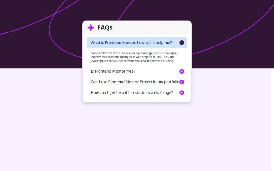
Design comparison
Solution retrospective
I am proud that I was able to use another CSS framework for the project (Bootstrap CSS).
What challenges did you encounter, and how did you overcome them?I was faced with the challenge of making the accordion button functional.
Community feedback
- @tinuolaPosted about 1 year ago
Unique solution to go with bootstrap. It's an efficient way to take care of accessibility--making the accordion navigable by keyboard. The animation also works nicely.
The layout/component size and icon positioning as the screen resizes down could use some tweaking. The text starts to get compressed/squished and the icons overlap the headings. There's also a light-blue background that shows up when the accordion is expanded. Looks like that might be a bootstrap thing?
0
Please log in to post a comment
Log in with GitHubJoin our Discord community
Join thousands of Frontend Mentor community members taking the challenges, sharing resources, helping each other, and chatting about all things front-end!
Join our Discord
