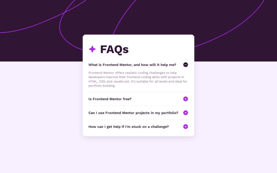
Design comparison
SolutionDesign
Solution retrospective
What are you most proud of, and what would you do differently next time?
This was my first Frontend Challenge with JavaScript. I got stuck on some details at times but I'm happy with result and learned lots of new stuff.
What challenges did you encounter, and how did you overcome them?I spent quite some time trying to figure out how to make the page accessible through keyboard navigation. I had a way to complicated approach at first (which didn't work anyway) until I found out about the attribute "tabindex".
What specific areas of your project would you like help with?Any kind of feedback is helpfull! One specific thing I'm not sure about:
- I tried to add a transition with CSS for the expanding answer, I am wondering if my approach is "best-practice" or if there are better solutions to this.
Community feedback
Please log in to post a comment
Log in with GitHubJoin our Discord community
Join thousands of Frontend Mentor community members taking the challenges, sharing resources, helping each other, and chatting about all things front-end!
Join our Discord
