Design comparison
SolutionDesign
Community feedback
- @cgambePosted 11 months ago
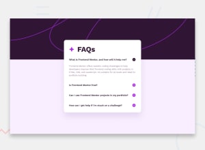
This accordion is very good, I really loved the transition it has. It is very good. Good CSS skills. But I noticed that you were not able to accommodate keyboard navigation. I think it will increase the accessibility of your page.
If you would like to accommodate keyboard navigation please read the following resources, I found it helpful during my project.
https://web.dev/articles/control-focus-with-tabindex
0@IndranjanaChatterjeePosted 11 months ago@cgambe ,Thanks a lot for the suggestion,I will surely try to implement
0
Please log in to post a comment
Log in with GitHubJoin our Discord community
Join thousands of Frontend Mentor community members taking the challenges, sharing resources, helping each other, and chatting about all things front-end!
Join our Discord
