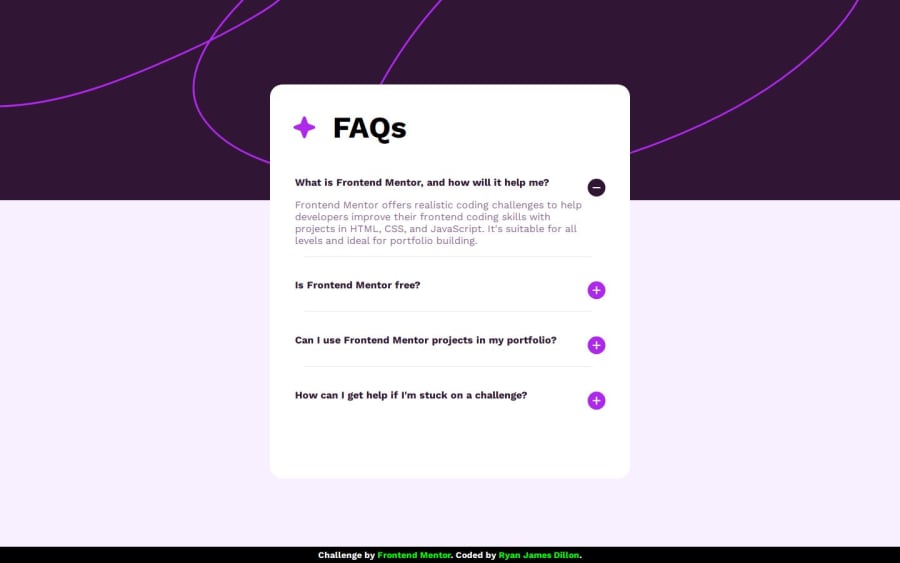
Design comparison
SolutionDesign
Solution retrospective
What are you most proud of, and what would you do differently next time?
Found the class toggle in JS quite easy, recently done something similar so was able to reuse the knowledge and refer back to the code when needed.
What challenges did you encounter, and how did you overcome them?Struggled to position the plus/minus icons. Spent a lot of time googling and playing around in dev tools. Got caught out with a caching that I wasted around 45 minutes trying to fix! Had to use Google and ChatGPT to build the JS transition as pure CSS was clunky!
What specific areas of your project would you like help with?General feedback!
Community feedback
Please log in to post a comment
Log in with GitHubJoin our Discord community
Join thousands of Frontend Mentor community members taking the challenges, sharing resources, helping each other, and chatting about all things front-end!
Join our Discord
