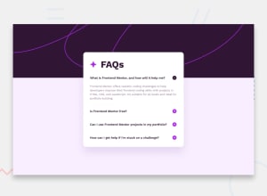
Design comparison
SolutionDesign
Solution retrospective
Hi there 👋, This is my solution for this challenge.
📑 Features:-
- Achieved 100% score for Accessibility, SEO & Best Practices and 98% score for Performance in Desktop Lighthouse. 📊
- Achieved 100% score for Accessibility, Best Practices and 97% score for Performance and 92% for SEO in Mobile Lighthouse. 📊
- Code implemented using BEM Methodology 💻
- For Loop, If else statement, addEventListener( ), get/setAttribute( ) 📝
- DOM 📝
- Simple Transition while showing & hiding answers. 🎬
- Clamp( ) method for responsive design ( changing according to viewport dimensions and suiting with different layout devices ). 💻 📱
- FlexBox 📦
- Code formatted using Prettier 💻
I'll appreciate any suggestions & feedback to achieve better performance.
Thank you. ✌️
Community feedback
- @rayaattaPosted 11 months ago
Hi, congrats on completing your project. I am not very experienced with JavaScript But I think in order to get your project looking closer to the original the fist question should be open by default. Ie if you had used css accordion The first question would have been Pre-selected as checked by default e.g
<input type="radio" checked>But I don't know how you will achieve it in js.apart from that your solution is smooth. Thanks
0
Please log in to post a comment
Log in with GitHubJoin our Discord community
Join thousands of Frontend Mentor community members taking the challenges, sharing resources, helping each other, and chatting about all things front-end!
Join our Discord
