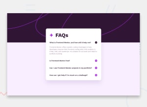
Design comparison
SolutionDesign
Solution retrospective
What are you most proud of, and what would you do differently next time?
I'm most proud of how close the design and layout is to the original.
What challenges did you encounter, and how did you overcome them?-
I had trouble finding the correct purple for the accordion header hover. I don't believe it was listed in the
style-guide.mdfile. -
I didn't know how to add keyboard focus for navigation. I used
useRef, a React hook. I'm not sure if this is the cleanest or simplest solution. ChatGPT helped here. -
I also had slight difficulties aligning the accordion header, button and text.
I'm curious if the keyboard focus solution that I implemented is reasonable. Is there a simpler or cleaner way?
function AccordionItem({ title, text }) {
  const [isOpen, setIsOpen] = useState(false);
  const headerRef = useRef(null);

  function handleToggle() {
    setIsOpen(prevIsOpen => !prevIsOpen);
  }

  const handleKeyDown = event => {
    if (event.key === 'Enter' || event.key === ' ') {
      handleToggle();
    } else if (event.key === 'ArrowDown') {
      const nextSibling = headerRef.current.parentElement.nextElementSibling;
      if (nextSibling) {
        nextSibling.querySelector('.accordion-header').focus();
      }
    } else if (event.key === 'ArrowUp') {
      const previousSibling =
        headerRef.current.parentElement.previousElementSibling;
      if (previousSibling) {
        previousSibling.querySelector('.accordion-header').focus();
      }
    }
  };
  return (


        {title}


        {text}


  );
}
Community feedback
Please log in to post a comment
Log in with GitHubJoin our Discord community
Join thousands of Frontend Mentor community members taking the challenges, sharing resources, helping each other, and chatting about all things front-end!
Join our Discord
