Design comparison
SolutionDesign
Community feedback
- @Yashi-Singh-1Posted 3 months ago
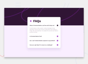
the background-color should be light color and the first questions answer should be display answer by default and challenge by should be after or outside the box.
and + and - sign should be in line
Marked as helpful0
Please log in to post a comment
Log in with GitHubJoin our Discord community
Join thousands of Frontend Mentor community members taking the challenges, sharing resources, helping each other, and chatting about all things front-end!
Join our Discord
