Submitted over 1 year ago
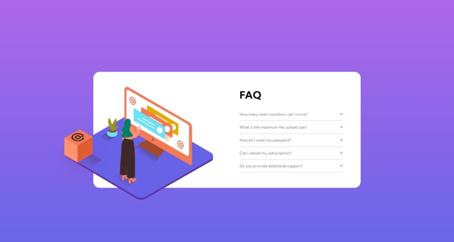
FAQ accordion page using JS - mobile first workflow
@mroungou
Design comparison
SolutionDesign
Solution retrospective
Hi everyone, this is probably my worst solution so far but I tried my best. I had quite a hard time with the desktop version. I had a lot of layout issues with the pattern as it was causing my div to overflow and things wouldn't fit properly so I decided to remove completely. I would like to know how others solved it. Just in general I had trouble with the images, I wasn't sure how they were supposed to be placed. I used relative and absolute positioning but I'm not sure if that's the way to go about it. All feedback is welcome. Thank you :)
Community feedback
Please log in to post a comment
Log in with GitHubJoin our Discord community
Join thousands of Frontend Mentor community members taking the challenges, sharing resources, helping each other, and chatting about all things front-end!
Join our Discord
