Submitted 3 months ago
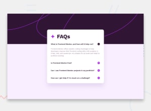
FAQ Accordion Page | CSS Flexbox | Mobile-first | Fluid Width/Height
@AgilePanda482
Design comparison
SolutionDesign
Solution retrospective
What are you most proud of, and what would you do differently next time?
I think the proudest thing I'm proudest of is finishing this challenge. I can't believe it took me 3 days to finish it.
What challenges did you encounter, and how did you overcome them?The biggest challenge I found was getting the CSS to look good on mobile, as well as correctly manipulating the DOM with JavaScript.
What specific areas of your project would you like help with?What other animations could be done when closing one tab and opening another? Also, Was the way I used div correct or should I have used the list tags?
Community feedback
Please log in to post a comment
Log in with GitHubJoin our Discord community
Join thousands of Frontend Mentor community members taking the challenges, sharing resources, helping each other, and chatting about all things front-end!
Join our Discord
