Design comparison
SolutionDesign
Community feedback
- @Ehsan-eslamiPosted 4 months ago
It's a grate solution for this challenge, I like it.
- The animations for drop down text is awesome and borders.
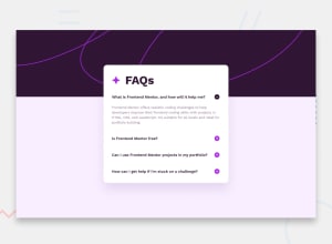
- Background Image works fine and responsive.
- Your Js logic works fine and simple, but it's better to delete the console.log in the develope branch.
- And make the dialog responsive, because in the mobile size it has a size problem
0
Please log in to post a comment
Log in with GitHubJoin our Discord community
Join thousands of Frontend Mentor community members taking the challenges, sharing resources, helping each other, and chatting about all things front-end!
Join our Discord
