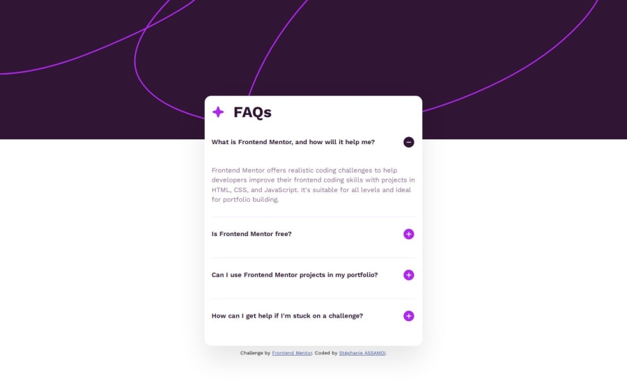

Design comparison
SolutionDesign

Community feedback
- P@SurajCaseyPosted 15 days ago
Good use of <main>, <header>, and <div> for structure. The <header> includes different images for mobile and desktop using .img__container-mobile and .img__container-desktop. This is a great responsive design approach. Use <button> instead of <div> for better keyboard navigation and screen reader support. Use buttons instead of divs for FAQ toggling. Improve accessibility by adding aria-expanded and using hidden. Optimize JavaScript to close other open FAQs when clicking a new one. Simplify HTML structure by removing unnecessary wrapper divs.
0

Please log in to post a comment
Log in with GitHubJoin our Discord community
Join thousands of Frontend Mentor community members taking the challenges, sharing resources, helping each other, and chatting about all things front-end!
Join our Discord