Design comparison
SolutionDesign
Solution retrospective
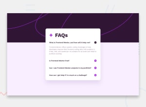
This was a good project, more difficult than the first few I started off with. Overall I think my solution is decent. I learned a lot more about CSS and used some Javascript in this project.
I found that I couldn't get the background image with the coloured background underneath to work properly so I would appreciate feedback on that. Other than that, any other feedback is welcome.
Community feedback
Please log in to post a comment
Log in with GitHubJoin our Discord community
Join thousands of Frontend Mentor community members taking the challenges, sharing resources, helping each other, and chatting about all things front-end!
Join our Discord
