FAQ Accordion (Next.js + Tailwind + TypeScript)
Design comparison
Solution retrospective
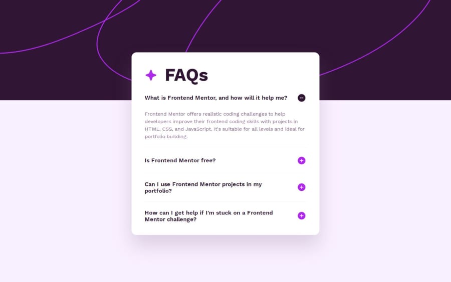
I'm proud of how I was able to come back to the design with fresh eyes after a few weeks and spot some room for improvement. Noticing the subtle underline between each accordion panel, or the subtle size change of the toggle/star icons was also apparent on a fresh view.
As I do more of these challenges, I come up with a more consistent methodology for working through builds and I'm going over my earlier challenges to make sure they're also things I want to be proud of!
What challenges did you encounter, and how did you overcome them?A challenge I encountered was translating Figma's auto line-height to code without having Dev Mode. I ended up being able to use the copy and paste as CSS feature to discover what the line height for each text element using auto was!
What specific areas of your project would you like help with?Accessibility, semantics, and also any idea help for improving the opening and closing of the accordion panel!
Community feedback
Please log in to post a comment
Log in with GitHubJoin our Discord community
Join thousands of Frontend Mentor community members taking the challenges, sharing resources, helping each other, and chatting about all things front-end!
Join our Discord
