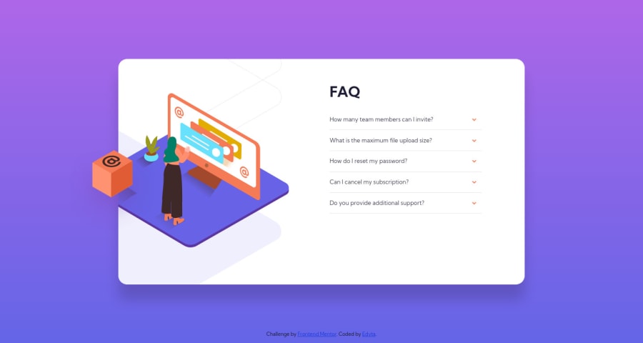
FAQ accordion, mobile first workflow, vanilla javascript
Design comparison
Solution retrospective
Not very happy with the solution, there is a possibly better way to position all images. Feel like my CSS file is a little mess. Any feedback is welcome.
Community feedback
- @markup-mitchellPosted over 3 years ago
I've looked at the CSS file and had a poke around with the solution in dev tools and I don't see anything much to be unhappy about!
You seem to have a class
accordian__titlethat you're not using, and styling the<h1>directly.... is my only observation (and I had to look quite hard for it).I can't even work out what's going on with the images... maybe I'll do the challenge myself and come back to you.
Seems like you've got a solution that works and there's no glaring issues!
Marked as helpful0
Please log in to post a comment
Log in with GitHubJoin our Discord community
Join thousands of Frontend Mentor community members taking the challenges, sharing resources, helping each other, and chatting about all things front-end!
Join our Discord
