Submitted 11 months ago
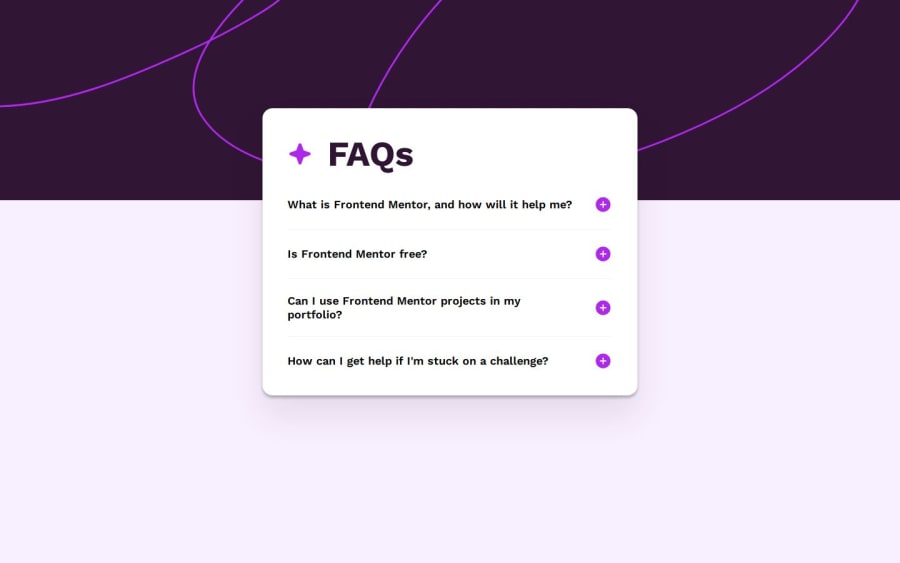
FAQ Accordion (JS/SCSS)
#accessibility#bem#sass/scss
@bartoszdudziak-dev
Design comparison
SolutionDesign
Solution retrospective
What are you most proud of, and what would you do differently next time?
- It looks ok overall
- The biggest encounter was to create animated accordion itself. I used a trick method with
grid-template-rowsmanipulation
- I still don't feel confident with dealing with
background-imagelike in this example. I don't have an idea how to make is sticky or stop from weird resizing - Similar with icons, should I use
imgorsvgtags? My solution includessvgbut I'm not sure my approach is good especially with toggle them - Please leave a comment or your opinion 🫡
Please log in to post a comment
Log in with GitHubCommunity feedback
- P@TorHamm
great work
Join our Discord community
Join thousands of Frontend Mentor community members taking the challenges, sharing resources, helping each other, and chatting about all things front-end!
Join our Discord
