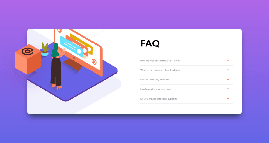
Design comparison
SolutionDesign
Solution retrospective
Using absolute positions for elements is challenging, especially with responsive design. It took me 3 tries before I started searching for accordion menu tutorials. I would have like to make the transitions smoother for the dropdown menu. But by the end, I just wanted to get it to a decent end result. Any advice on absolute positioning and responsiveness is greatly appreciated. Thank you!
Please log in to post a comment
Log in with GitHubCommunity feedback
No feedback yet. Be the first to give feedback on Bobby S's solution.
Join our Discord community
Join thousands of Frontend Mentor community members taking the challenges, sharing resources, helping each other, and chatting about all things front-end!
Join our Discord
