Design comparison
SolutionDesign
Solution retrospective
What are you most proud of, and what would you do differently next time?
I think that after many tries in different small projects I have finally started to understand how accordion items work. I used grid layout for transitioning for height 0 to auto which make thinks a lot easier.
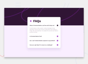
What challenges did you encounter, and how did you overcome them?The background screen pattern is something that I struggled with. I think that I need to work better on this topic
What specific areas of your project would you like help with?I think that I didn't manage to display the background pattern like the design. I don't think that I understand how the background-position property works especially for smaller screens.
Community feedback
- @konradbaczykPosted 3 months ago
It looks really good :)
0
Please log in to post a comment
Log in with GitHubJoin our Discord community
Join thousands of Frontend Mentor community members taking the challenges, sharing resources, helping each other, and chatting about all things front-end!
Join our Discord
